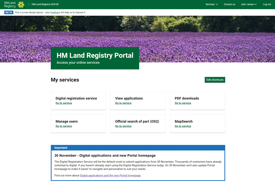
The HM Land Registry customer portal redesign – 30 November
Since its launch in 2009, the customer portal has become the front door into HM Land Registry for the majority of the Land Registry’s customers.
While new features and services had been added over the years, one thing that hasn’t changed is the way it looks, but from 30 November that is going to change.

Digital by default
HM Land Registry will be launching the first phase of its portal redesign on the day of going digital by default: 30 November. This is the day the Digital Registration Service will become the default application submission service on the portal and the redesign is a key component in making it easier to submit digital applications.
What will be changing?
Starting with the homepage, the portal will have a new look and feel and has been designed to make the portal easier to use and to better support customers in submitting digital applications and managing their applications. This redesign won’t be changing any of the services, but it will change how Land Registry customers use and interact with the portal – beginning with a personalised homepage.
Users of the portal will see:
-
- simpler navigation
- the ability to personalise the shortcuts displayed on the homepage
- digital application submission by default
- easier access to the information they need
- streamlined administration
The Land Registry have made these changes not only to improve the service provided by the portal, but also so this streamlined approach will ultimately help customers complete their work faster.
From 30 November our customers will see the redesign on the portal homepage, Digital Registration Service and View Applications. The Land Registry be completing further work to bring the login page and the rest of the portal into this design in the coming months.
The first time you log in you will be asked to setup your shortcuts on the new homepage:
1. Once logged in, select start to set up your shortcuts. If you’d like to skip this step, you can click the option to ‘Use default customisation’.
2. Select the correct information from the two dropdown boxes.
3. Select the 6 services you use the most from the dropdown boxes.
4. Your homepage is now set up. If you want to change your shortcuts, you can change your chosen services using the ‘edit shortcuts’ button.
HM Land Registry has put together more detailed guidance on its portal guidance page.
The design
HM Land Registry have received a lot of feedback from customers that the portal currently looks clunky and old-fashioned; a fair criticism given it’s 13 years old!
The design they’ve gone for aligns with other government designs along with using design patterns approved by GDS (the Government Digital Service) – the Cabinet Office unit tasked with helping people interact with government and to support government to operate more effectively and efficiently.
By using the GDS design patterns, HM Land Registry has drawn on its years of research and expertise to create a simple design that has ease of use at its heart, along with ensuring that it meets the most recent accessibility and user experience standards.
Eddie Davies, Deputy Director of Digital Services at the Land Registry, writing in his blog, says that he is proud of the work completed to make this possible:
“Our objective is to support the development of a simpler, paperless, transparent and user-friendly process for buying and selling property. This update to the portal, and the move to digital by default, is a major milestone in achieving this objective which we hope will ultimately lead to better services and quicker applications, when combined with the other changes and updates we’re making to our services and processes.”
Key links:
Kindly shared by HM Land Registry


